Monday, April 27, 2015
Microagression
Just recently actually that I have experienced a microagression not knowing the term for it. While I was returning home from school with my little brother and entered our apartment building elevator, one of the residents got in as well. As the door close and I clicked on my floor, she asked us where we were from. And right away I felt super uncomfortable but you wouldn't be able to tell with the look on my face. My brother answered her saying China and I facepalmed in my mind so hard. After we got off on our floor and the elevator door closed I said to him that we were born in America not China. Our parents were born there. I am in the mindset that you are the product of your environment and since him and I have lived in America all of our lives we have put on the American lifestyle and culture. I didn't remember this until it was brought up in class and now that I have looked back on it, I kind of feel as though as I am not what my environment shaped me to be. Her question rubbed me the wrong way and I think that this is an issue that needs to be resolved. Remarks like those is what lead to stereotypes and eventually straight up racism. A solution I find most ideal to solve it would be to teach children when they are young the importance of sef monitoring when it comes to being ill informed about race and stereotypes.

Sunday, March 15, 2015
- Look through and pick 5 book covers that catch your eye- save the photos on to your desktop.
- Post the photos of the 5 cover designs and write what you like about each one. Try to be specific.
- Do you see the design concepts and components like Typography, Images/Graphics, Proximity, Alignment within the work?
- Think about why you were drawn to this book cover. What made you take a closer look?
- With the 5 you chose, what are some common characteristics between them? What are the differences?

The thing about this poster is that the dog on it reminds me of Spike from Tom and Jerry. The mirror effect here makes the design sort of intimidating and eerie, like how a pitbull would appear to timid people. The upside down text here matches with the reflection with the dog adding more to the appeal of the cover. It's as if it were trying to combine topdog and underdog like the sides of a coin.

This one I found interesting because of the person shown here makes me think of James Bond because he looks like he has a gun and plus, he's pretty suave. Definitely, very eye catching and reminiscent to the 90s.

The separation of the shapes make it look like a one-eyed, yellow lipped monster.


Wednesday, March 11, 2015
Favorite Book Cover

I think that the design is not successful in capturing the book's main idea, mood, or storyline, because it is too simple for the complexity of the issues Yossarian faces in Catch-22. Yossarian's predicament is both ironic and depressing. He wants to relinquish his duties but the only way to do so is to be diagnosed as insane, however, one must go to the doctor and ask to be relinquish of duty because he/she is insane but in doing so will confirm he/she as sane as wanting to not fly more missions to preserve one's health is perfectly sane. Something as complex as Catch-22 would be difficult to embody in a book cover like this.
Tuesday, March 10, 2015
Logo Reflection5x(s)
The most challenging aspect of creating my Logo Design was trying to incorporate the ideas and concepts I learned from my interview of the team. I wanted to convey a strong meaning behind the team but also make it clear what the logo is of. Keeping things simple and clean was another factor that prevented me from achieving my ideal design. I had to get rid of the phoenix I initially wanted.
I overcame this challenge this challenge by spacing out the components of my logo and getting rid of unnecessary items such as the phoenix, which although is a popular component, complicated my design.
The most successful aspect of my Logo design is the symbol because I feel as though it has demonstrated the idea that Frisbee is a sport not unlike baseball or basketball in terms of needing discipline and skill.


Monday, February 23, 2015
What Did I Do Over The Break?
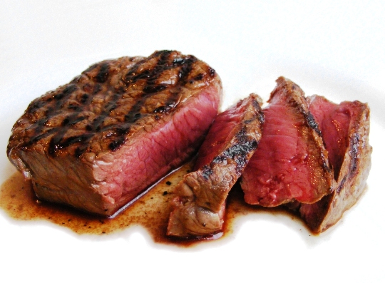
I could be like William and say my break was very much uneventful, but I am not going to. My break comprised mostly of staying up late and barely doing any homework. I did however spent many hours playing games many with my brother but if he ever lost he would be such a sore loser about defeat and all I could say was that he needed to drink some H2O cause he was so salty. I also "celebrated" Chinese New Year, and by "celebrate" I mean getting money and staying home that day. Some foods that I enjoyed over the break included instant ramen, turkey ham sandwiches with pickles, and oh so juicy, moist, delicious, steak.

Wednesday, February 4, 2015
Looking at Art in NYC (Scandulous Style)
 |
| "Grey Line with Lavender and Yellow" by Geordia O'Keeffe |
b) The interesting thing about this piece that drew my attention was how "stuck in the gutter" my head was when I found this piece. My suspicions about this piece were confirmed when I went to read the info card beside the art describing it. It reminds me of something I can't actually put on this rated PG-13 blog, but if you look at this piece long enough you might understand why. The simplicity and symmetrical nature of the peiece also mesmerized and stole away my attention.
c) Well aside from what I have stateed in my first two points, I know that this piece was made in 1923. It was made out of oil and created on a canvas. The artist Geordia, was an American who was born in 1887 and died in 1986. She is also known for making abstact artworks based on nature.
Monday, December 22, 2014
Finding Type
You must identify which category the type is under.
Where and what was the type used for?
Do you find the typeface to be appropriate for its purpose?

1) Modern
2) It was used in a park as a sign to indicate to people that shoes need to be worn while in the park.
3) I find it appropriate because it seems very serious.

1) It doesn't seem to fit any other than Decorative
2) It was used to "catch" buyers (pun intended) with the sleek design
3) I find it very appropriate because the snack is suppose to be friendly and expresses playfulness with its font

1) Modern, Sans Serif
2) It was used to make people feel at ease around the neighborhood
3) It seemed appropriate because the multiple types of fonts help keep a welcoming presence

1) Sans Seriff
2) It was used to envoke assurance and radical feelings
3) I don't think it was approprriate because it comes off trying to be too hip

1) Definitely Sans Serif, trust me
2) It was used to assert seriousness and order to tell people to not do something
3) I think it's okay but the sign doesn't seem very convincign

1) Modern
2) It was used to show that the orange juice was truthful in its design
3) I don't think this typefont is appropriate because it seems unappealing and bland
Wednesday, December 17, 2014
Club Logo Club Interview - Ultimate Frisbee
So before I start working on creating a logo for the ultimate frisbee club, I had to get an idea for how it should be. To begin, I asked one of the members of the team about the club. Although I am a member of the team, I only joined recently within the last three months and having a perspective from a person who has been in the club longer would definitely provide a better understanding of the club. I asked one of the team captain, Nicole.
According to her, the main purpose of the club was teach more people about the world of ultimate frisbee. This is because ultimate is not as popular of a sport as baseball or football and those who cannot or do not want to play the more popular sports could try frisbee as an alternative and learn how competitive and fun it is to other sports. Although it is a sport, the club has a friendly environment from both Millennium High School and Millennium Brooklyn High School. Members collaborate and bond with others as a team. Getting to the practices is probably the most tedious obstacle because Millennium High School and Millennium Brooklyn are located in two different boroughs making a meetup at Prospect Park somewhat unreliable if the weather is extreme. Nicole says that five words that best describe the club would be life, new, stress relieving, talent, and especially fun. Five images that she says best symbolize the team are layouts, frisbees, teamwork, strategizing, and frisbee tricks.
The club originally started out as a small team of people composed of ultimate players and expanded throughout the years as more people wanted to learn and play frisbee. The key principles the club practices are communication and hard work. These key ideas allowed the team to grow and become better managing to win 2nd place last year in the b-league (open division). And whther or not the team wins or loses it is more important that we did it as a team. We will overcome defeat and achieve our goal as one. We are also developing our team this year by trying to go to state tournaments.
Tuesday, December 16, 2014
Good Logos
Create a blog post about your favorite logo(s). Name one brand/logo that you own and enjoy and explain why you think the logo is well designed. Then chose one logo that you are not familiar with from the best logo design links I have below (the first two). Chose one that you think is well designed and explain why.

One brand that I own and enjoy is the Pepsi Cola brand because it is both simplistic and identifiable. The logo on the soda is a circle with red white and blue inside of it. The red portion is on top while a white curved line goes through the middle separating the red from the blue portion on the bottom of the circle. When I drink Pepsi I feel a refreshing sensation, but when I look at the logo I feel even more rejuvenated. The colors might seem patriotic but I don't get that feeling. Simpleness and the few colors used help make the logo stand out making it a good logo.
One logo I am not familiar with but is very popular that I have found is the Sop Wise logo. I think that this is a very good logo because it stands out and is very intriguing. I cannot recall a logo I have seen before that had a bag-faced disembodied head with an outstanding mustache such as this one. The opaque glasses also emphasize the concept of choosing a good choice in shopping at Shop Wise.
One brand that I own and enjoy is the Pepsi Cola brand because it is both simplistic and identifiable. The logo on the soda is a circle with red white and blue inside of it. The red portion is on top while a white curved line goes through the middle separating the red from the blue portion on the bottom of the circle. When I drink Pepsi I feel a refreshing sensation, but when I look at the logo I feel even more rejuvenated. The colors might seem patriotic but I don't get that feeling. Simpleness and the few colors used help make the logo stand out making it a good logo.
One logo I am not familiar with but is very popular that I have found is the Sop Wise logo. I think that this is a very good logo because it stands out and is very intriguing. I cannot recall a logo I have seen before that had a bag-faced disembodied head with an outstanding mustache such as this one. The opaque glasses also emphasize the concept of choosing a good choice in shopping at Shop Wise.
Monday, December 8, 2014
 |
| Background Image |
 |
| Starting - Before |
 |
| Final - After |
Tuesday, November 18, 2014
Shape to Symbol GIF
 |
| Gif.Apple |
So, finally here is my completed gif. I will not tell you what it is because that is also apart of the project, so instead figure it out for yourself. This was made in Photoshop specifically using CS6. It is a professional tool with this project being my first project created on this program. I really enjoyed using it a lot, much better than MS Paint. It wasn't without its hardships though.
One of the most frustrating aspects of the program (aside from working with a slow mouse w/o admin powers) was constantly having to switch between the different tools manually. Granted I could have looked it up but hindsight is a thing. None of the tools seem to complicated for me to use. In having prior knowledge of working with MS Paint I knew some of the basics with Photoshop. The mini-lessons in class definitely aided me in learning all the different tools. The selection tools were the most useful set of tools for me because the tools allowed me to microscopically edit my design and fix my unintended marks.
Now completing the project the tool that I feel the most confident in using is undo tool. No, its actually the selection tool because I understand what it does and how to apply it. It allows me to work in desired areas without affecting other portions of my design.
The tool that I have gotten better at using is the eyedropper tool because it only does one thing and does that one thing well. This does not include its subsection of eyedropper tools but the main one that selects a color when pointing at a pixel of one color. Simple, effective, incredibly useful. No more having to save paints over night so that you don't have to mix paints just to produce the same colors amiright?
The next thing that I would want to create using Photoshop is a short video almost vine-like video of me and my friends doing things. I guess just vines in general but substituting Photoshop for my other programs to edit videos. I would incorporate the most obscure details in my videos and see if people could understand my allusions.
Sunday, October 26, 2014
Create Your Own GIF

"Can't Stop the Fun Train"

"Yes!!!"
I couldn't decide between one, so I put up both. I tried to have my brother recreate his initial excitement when we were walking home and he had received a very rare prize from his Iphone app. Not quite the same, but still gets the job done I guess.
Monday, October 20, 2014
GD Concept Board - Suprematism

I am interested in Suprematism because it follows my simple desire and also because I wanted to delve more into the pre World War I in Russia outside of the formal aspects.
Suprematism occurs at a time I am very familiar with: early 1900s Russia. During that time Russia was involved with WWI. The country was in turmoil. Poverty struck many families during that time. Tsar Nicholas II was also quite an incompetent ruler and the Bolshevik Revolution was about to hit. With my prior knowledge of historical context I feel that I would understand this movement compared to other movements. Suprematism is a “non-objective style of art [and] simplification of form and use of geometry influenced” (design history). Squares and circles are the most common shapes used in suprematism. Kazimir Malevich is stated as the leader of the movement (design history). According to design history, “It was [primarily] developed in the field of painting although its practice extended to poetry and theater. It also revitalized an interest in traditional Russian folk art” (design history).
Suprematism impacted Graphic Design today because it inspired change from the old to the new. As oppose to more conservative ways, old traditions, suprematism has simplified the more complicated matters. Use of geometric shapes and simplicity contrasts with the more traditional art works of the time. So in a sense, suprematism has affected graphic design by allowing new works to be simpler instead of complicated.
Reference Links:
http://www.theartstory.org/movement-suprematism.htm
Suprematism impacted Graphic Design today because it inspired change from the old to the new. As oppose to more conservative ways, old traditions, suprematism has simplified the more complicated matters. Use of geometric shapes and simplicity contrasts with the more traditional art works of the time. So in a sense, suprematism has affected graphic design by allowing new works to be simpler instead of complicated.
Reference Links:
http://www.theartstory.org/movement-suprematism.htm
Monday, October 6, 2014
Example of Good Graphic Design

Thursday, October 2, 2014
Inspiration / Interests
SO, if you're really observant and have scoured my last few posts for details about me, then you would find that I really like movies. I'm not a big movie buff, but I think I see plenty movies every month more so than the average person (in the 1980's that is). Anyway I mention this because a movie that I have seen that changed my way of thinking and inspires me is the The Matrix. It is like one of my favorite movies. Last year in English class I learned about existentialism and dystopian societies. Although the movie doesn't appear to push on existentialist ideas, I managed to think about them. The movie asks what it means to be obscured in "fake" satisfaction or harsh "reality". Also the themes of control and fate are present in the movie. These connect to existentialism because existentialism questions why our purpose is in life and what we live for. Do we live to only drown ourselves in happiness? Do we seek to benefit society? Or our we just some lesser beings that should devout ourselves to religion and spreading it? I believe my existence is not something bound by these other purposes in life. My choices and freedoms are my own. I rather focus on the other things in life.
 |
| "East River and 2014 Summer Sky from Manhattan Bridge while Bike Riding" |
I took this picture during the last few days of summer and I keep it as a reminder to enjoy life and to not be bard down by the oppressiveness of our harsh realities.
Monday, September 29, 2014
Letter Project Reflection
1) For the letter project, the process of creating it was very fun for me. The creative range I had was really useful for me to brainstorm many ideas as to what I would design after choosing my letter. Although I wished I had been a little more restricted on myself because too many options led me to be unsatisfied with having multiple ideas that I could not fit into a 8 1/2 by 11 inch paper.
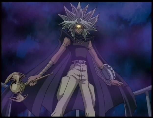
2) Arriving at a concept for my letter was a bit tricky. I was not quite sure what I wanted to represent in my letter. After burning my brain out I thought the best concept I could choose had to be something I could do simply without making my design complex. So I chose ominous and obscurity because then I would not need to be overly complicated in design. I visually represented this in my design by having my letter appealing like an oddly shaped person, but upon further inspection is missing more detailed features that "normal" person. This is truly unsettling. The background, which is also not finished at this time, is not any identifiable setting, creating an eerie atmosphere.
3) The most challenging aspect of this project was finding a way to show my concept and letter without being very obvious. It seems I like it could be more concealed and discreet. It was difficult trying to keep the letter in tact while sketching a semi-realistic stick body.
4) Still not finished but so far I could say I am not satisfied. The background I desired was suppose to be more rainbow-like. The body I should have used references like Slender Man. I also wanted a purply shadow like effect surrounding the body.
5) If I could change my design, the thing I would do differently besides what I have mentioned above would be to be to make it hyper realistic because it would bring in the uncanny valley characteristic that I wanted.
2) Arriving at a concept for my letter was a bit tricky. I was not quite sure what I wanted to represent in my letter. After burning my brain out I thought the best concept I could choose had to be something I could do simply without making my design complex. So I chose ominous and obscurity because then I would not need to be overly complicated in design. I visually represented this in my design by having my letter appealing like an oddly shaped person, but upon further inspection is missing more detailed features that "normal" person. This is truly unsettling. The background, which is also not finished at this time, is not any identifiable setting, creating an eerie atmosphere.
 |
| "unfinished" |
4) Still not finished but so far I could say I am not satisfied. The background I desired was suppose to be more rainbow-like. The body I should have used references like Slender Man. I also wanted a purply shadow like effect surrounding the body.
5) If I could change my design, the thing I would do differently besides what I have mentioned above would be to be to make it hyper realistic because it would bring in the uncanny valley characteristic that I wanted.

Thursday, September 11, 2014
First Time Be Gentle
Hey what's up people David here with the very first post of this blog! This blog is gonna be the very best blog out there, the best there ever was. We're gonna have only the best posts about the best and trendy things out there in the world. Even now in this post there is a trendy topic to discuss. That is of course blogs. But on a serious level you will follow this blog right after reading this post.
Ok okay but on a super serious level I guess I should do the assignment. I am in a graphic design class and this is what that blog is for. I'm quirky and outgoing, proud and independent, wise and arrogant. What I am saying is I'm human. I'm not a robot. But I am also not the ONE. See what I just did there? That's right I also have super powers but not like god-like super powers. Anyway I promise I won't make any more movie references.
Ok okay but on a super serious level I guess I should do the assignment. I am in a graphic design class and this is what that blog is for. I'm quirky and outgoing, proud and independent, wise and arrogant. What I am saying is I'm human. I'm not a robot. But I am also not the ONE. See what I just did there? That's right I also have super powers but not like god-like super powers. Anyway I promise I won't make any more movie references.
Subscribe to:
Posts (Atom)