Sunday, March 15, 2015


  • Look through and pick 5 book covers that catch your eye- save the photos on to your desktop.
  • Post the photos of the 5 cover designs and write what you like about each one. Try to be specific.
  • Do you see the design concepts and components like Typography, Images/Graphics, Proximity, Alignment within the work? 
  • Think about why you were drawn to this book cover. What made you take a closer look? 
  • With the 5 you chose, what are some common characteristics between them? What are the differences?
The thing about this poster is that the dog on it reminds me of Spike from Tom and Jerry.  The mirror effect here makes the design sort of intimidating and eerie, like how a pitbull would appear to timid people. The upside down text here matches with the reflection with the dog adding more to the appeal of the cover. It's as if it were trying to combine topdog and underdog like the sides of a coin.

This one I found interesting because of the person shown here makes me think of James Bond because he looks like he has a gun and plus, he's pretty suave. Definitely, very eye catching and reminiscent to the 90s. 
The separation of the shapes make it look like a one-eyed, yellow lipped monster.

Wednesday, March 11, 2015

Favorite Book Cover


I think that the design is not successful in capturing the book's main idea, mood, or storyline, because it is too simple for the complexity of the issues Yossarian faces in Catch-22. Yossarian's predicament is both ironic and depressing. He wants to relinquish his duties but the only way to do so is to be diagnosed as insane, however, one must go to the doctor and ask to be relinquish of duty because he/she is insane but in doing so will confirm he/she as sane as wanting to not fly more missions to preserve one's health is perfectly sane. Something as complex as Catch-22 would be difficult to embody in a book cover like this.

Tuesday, March 10, 2015

Logo Reflection5x(s)


The most challenging aspect of creating my Logo Design was trying to incorporate the ideas and concepts I learned from my interview of the team. I wanted to convey a strong meaning behind the team but also make it clear what the logo is of. Keeping things simple and clean was another factor that prevented me from achieving my ideal design. I had to get rid of the phoenix I initially wanted. 

I overcame this challenge this challenge by spacing out the components of my logo and getting rid of unnecessary items such as the phoenix, which although is a popular component, complicated my design.

The most successful aspect of my Logo design is the symbol because I feel as though it has demonstrated the idea that Frisbee is a sport not unlike baseball or basketball in terms of needing discipline and skill.


Before - After Announcement Poster

Before
After

Monday, February 23, 2015

What Did I Do Over The Break?

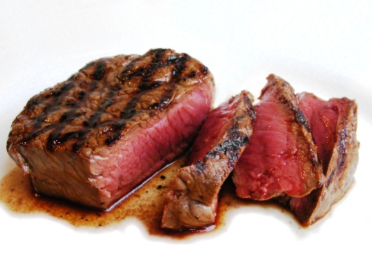
I could be like William and say my break was very much uneventful, but I am not going to. My break comprised mostly of staying up late and barely doing any homework. I did however spent many hours playing games many with my brother but if he ever lost he would be such a sore loser about defeat and all I could say was that he needed to drink some H2O cause he was so salty. I also "celebrated" Chinese New Year, and by "celebrate" I mean getting money and staying home that day. Some foods that I enjoyed over the break included instant ramen, turkey ham sandwiches with pickles, and oh so juicy, moist, delicious, steak.


Wednesday, February 4, 2015

Looking at Art in NYC (Scandulous Style)

"Grey Line with Lavender and Yellow"
by Geordia O'Keeffe
a) This artwork piece by Geordia O'Keeffe I found at the Metropolitan Museum in its Modern Section. This piece hanged on a column facinf inward in a single room surrounded by other Modern arts, not necessarily all abstract or realistic art, but art done within the past century or so.

b) The interesting thing about this piece  that drew my attention was how "stuck in the gutter" my head was when I found this piece. My suspicions about this piece were confirmed when I went to read the info card beside the art describing it. It reminds me of something I can't actually put on this rated PG-13 blog, but if you look at this piece long enough you might understand why. The simplicity and symmetrical nature of the peiece also mesmerized and stole away my attention.

c) Well aside from what I have stateed in my first two points, I know that this piece was made in 1923. It was made out of oil and created on a canvas. The artist Geordia, was an American who was born in 1887 and died in 1986. She is also known for making abstact artworks based on nature.


Monday, December 22, 2014

Finding Type

You must identify which category the type is under.
Where and what was the type used for?
Do you find the typeface to be appropriate for its purpose?
 1) Modern
2) It was used in a park as a sign to indicate to people that shoes need to be worn while in the park.
3) I find it appropriate because it seems very serious.

 1) It doesn't seem to fit any other than Decorative
2) It was used to "catch" buyers (pun intended) with the sleek design
3) I find it very appropriate because the snack is suppose to be friendly and expresses playfulness with its font

 1) Modern, Sans Serif
2) It was used to make people feel at ease around the neighborhood
3) It seemed appropriate because the multiple types of fonts help keep a welcoming presence

 1) Sans Seriff
2) It was used to envoke assurance and radical feelings
3) I don't think it was approprriate because it comes off trying to be too hip

 1) Definitely Sans Serif, trust me
2) It was used to assert seriousness and order to tell people to not do something
3) I think it's okay but the sign doesn't seem very convincign

1) Modern
2) It was used to show that the orange juice was truthful in its design
3) I don't think this typefont is appropriate because it seems unappealing and bland