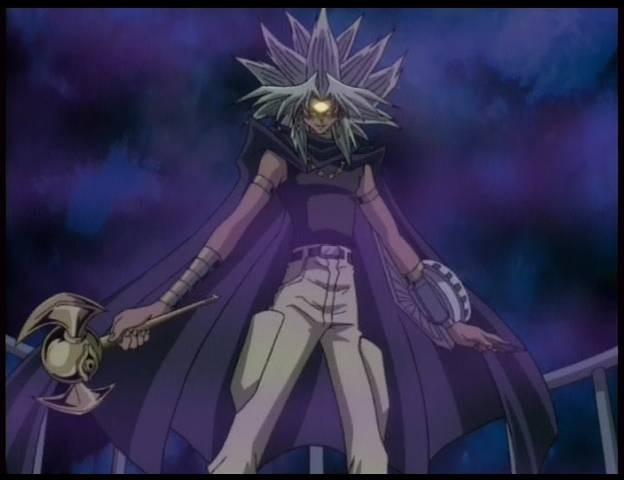
2) Arriving at a concept for my letter was a bit tricky. I was not quite sure what I wanted to represent in my letter. After burning my brain out I thought the best concept I could choose had to be something I could do simply without making my design complex. So I chose ominous and obscurity because then I would not need to be overly complicated in design. I visually represented this in my design by having my letter appealing like an oddly shaped person, but upon further inspection is missing more detailed features that "normal" person. This is truly unsettling. The background, which is also not finished at this time, is not any identifiable setting, creating an eerie atmosphere.
 |
| "unfinished" |
4) Still not finished but so far I could say I am not satisfied. The background I desired was suppose to be more rainbow-like. The body I should have used references like Slender Man. I also wanted a purply shadow like effect surrounding the body.
5) If I could change my design, the thing I would do differently besides what I have mentioned above would be to be to make it hyper realistic because it would bring in the uncanny valley characteristic that I wanted.
I still think you should've went with the animal concept because this one seems really simple.
ReplyDeleteI can relate since I like dance too :) But I really like how you incorporated the letter into the body of the dancer. Your drawing is unique because even though the picture is still, it looks as if their is motion going on. Very nice.
ReplyDeleteThis is awesome. I love the figure in motion. Also the background goes perfectly with your letter without giving it too much noise.
ReplyDeleteI find ur art very simple yet powerful in a way where it conveys a meaning of body movement. I agree with you 100+10% that keeping it simple is the best way to do it. Perhaps finishing the white tiles would be great :P
ReplyDeleteI really like your picture, I don't know why but I smiled when I saw it. Then i started to laugh but not in bad way I swear! It's just seems to make me happy for some odd reason and I agree to your argument on how it lacks a lot of normal human features but the lack of those things makes your picture very abstract. It's not normal but that's what makes it interesting cause normal is boring. ^^
ReplyDeleteHi David!! Your idea was very simple, but very fun. It kind of reminds of a turtle mixed with a person walking. Very interesting.
ReplyDeleteI love the material you used to color in your design because it really goes with your concept.
ReplyDeleteYour design looks cool! The light green background really enhance the letter and by coloring the letter black, it really made the focal point clear. I also think it is really creative how you built a stick-figure out of the letter.
ReplyDeleteI really really like this idea. It is very creative and has a child like aspect to it, which is good. It is simple but the concept/idea is enhanced with the design chosen.
ReplyDeleteIt's interesting that you decided to draw your letter with scribbles and the color black because it helped bring out the ominous/mysterious feeling you were going for. I think if you made your background more darker, then it would've helped bring out your concept even more!
ReplyDeleteI thought this idea was very creative and cool, but i think you could've put more time into making the person more abstract by adding other features to him. Other than that I really liked the idea and background.
ReplyDelete